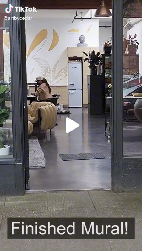
In May/June 2022, I was commissioned to paint this mural for Studio 7 Design, an interior design studio in NW Portland, Oregon.
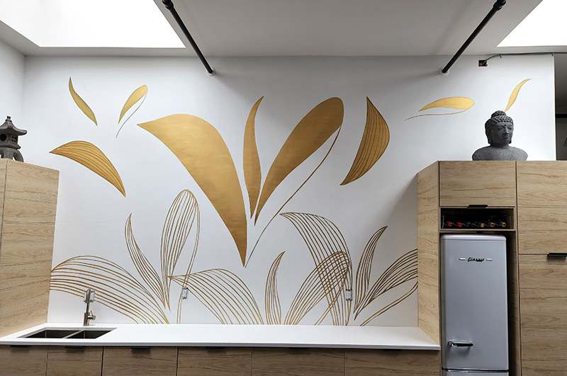
I painted the mural on the 12’ x 17’ wall in the back of their beautiful storefront design workspace. A kitchen fills this end of the room, with a countertop spanning the width. I worked up on top of the countertop, sometimes with the help of ladders, to reach every part of the wall.
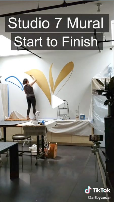
The design, requested by the clients, is based on their sleek golden company logo.
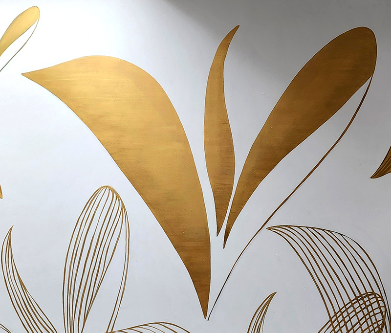
The logo, made up of leaf and petal-like shapes, was inspired by plant life.
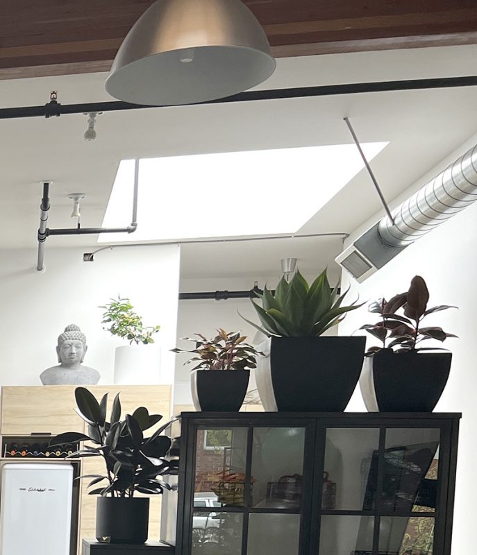
The studio itself is full of potted plants, which thrive in the light of two giant skylights in the ceiling.
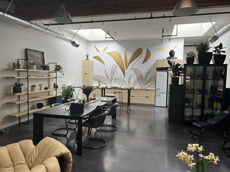
The client requested the full logo as a large centerpiece of the design, painted in shimmering metallic gold paint with horizontal brush strokes to resemble brushed metal.
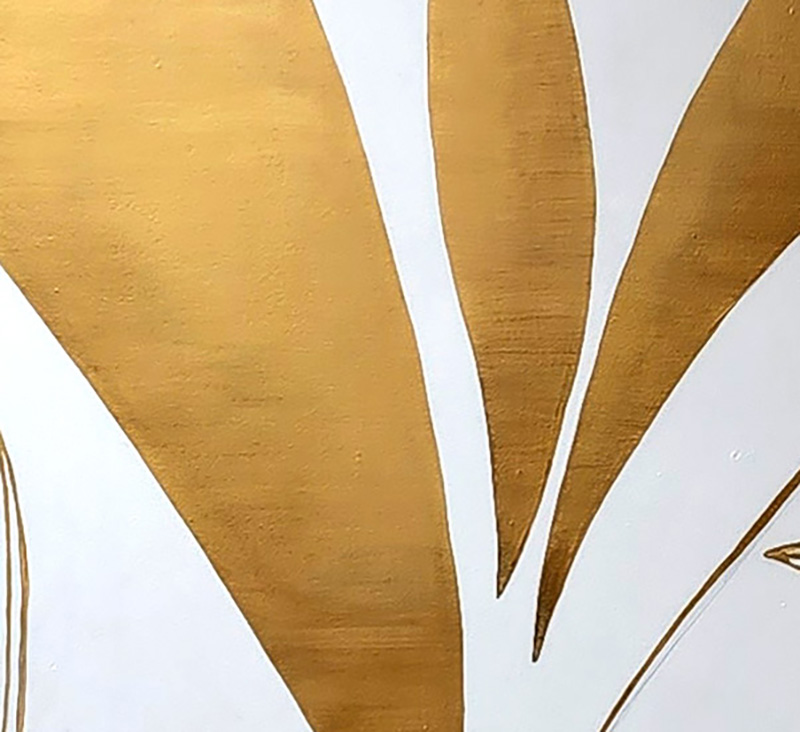
This center focal point is surrounded by shapes taken from the deconstructed logo, flowing gracefully across the wall. The fragments of gold shimmer and glow as the sun from the skylights above shifts across them throughout the day.

The logo itself is sharp and perfect, while lines, reminiscent of veins on some of the leafy shapes, are more organic, painted in a looser, freehand style.
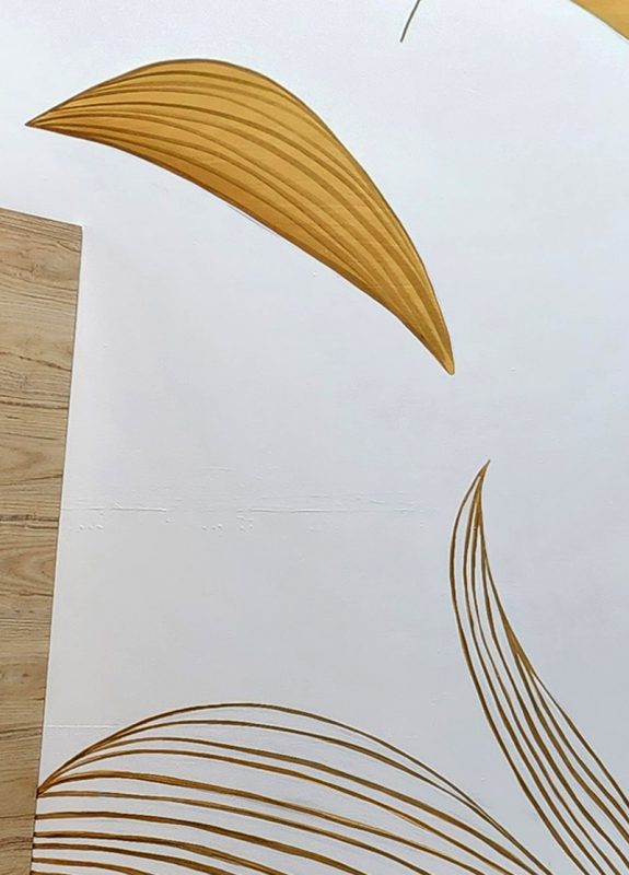
The shapes along the bottom of the design are the same shapes in the logo, repeated as delicate line drawings that overlap each other.
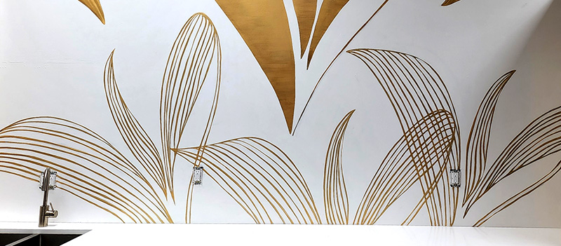
This mural is full of symbolism. This is a design studio, a creative space where concepts evolve from ideas into plans of action.
So, the pieces of the logo are coming together and flying apart, existing in various ephemeral iterations. The shapes float around and merge together until they solidify into something strong, bold and elegant—much like ideas being floated, morphing into new versions, and coming together over the course of a design project.
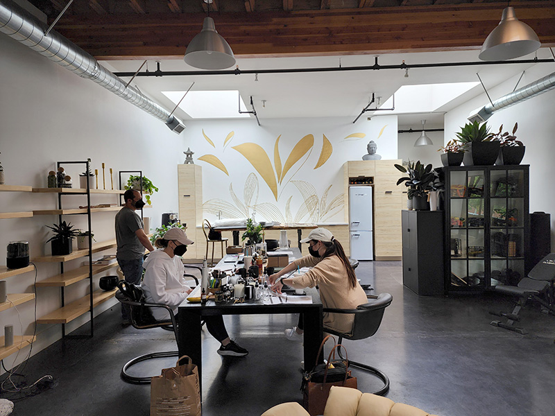
The decision to paint this mural in a simple color palette—gold with undertones of bronze on the white wall, keeps the image light and airy, and meshes well with the white, black, and gold tones throughout this workspace.
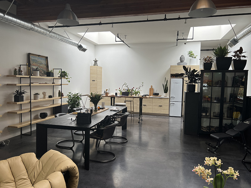
Here you can see the before and after which shows how much this mural has transformed the space!
Before:
After:
When you walk or drive by the front window of Studio 7 Design, your eye catches a glint of gold and makes you look twice. We noticed that every person walking by on the street turned their head to look closer at the mural as they passed by!
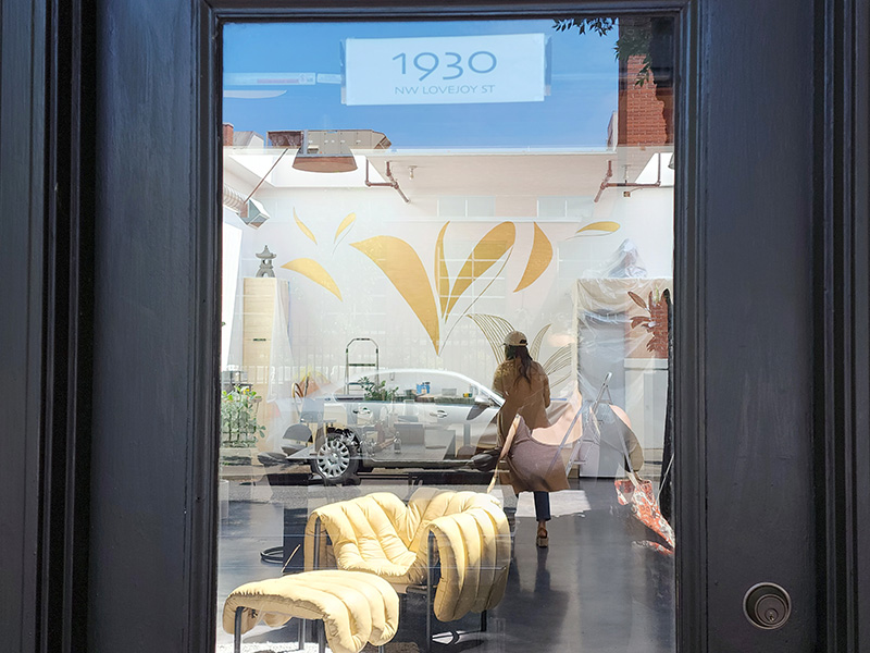
Here’s what it looks like when you walk into the building from the street outside:
