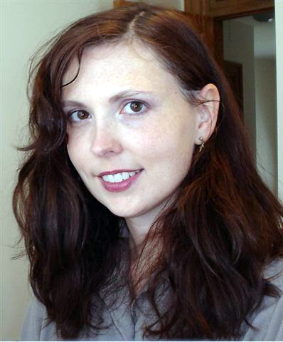
Here’s another portrait: Kenna. This one was challenging at times, but I think I’m pleased with it.
The reference photo:
The painting:
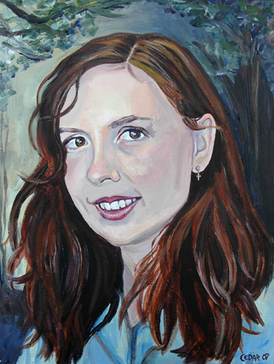
This painting is 16″ x 12″. I’ve been doing smaller portraits lately. (Which is probably a good thing, since I was getting out of hand, painting enormous heads on enormous canvases. In one of my portraits, the person’s face was 27″ tall. Sheesh.) But to go along with my shift towards sanity in portrait-painting, I had to get some tiny paintbrushes, of course. I have 5 new paintbrushes with nearly microscopic bristles, and I’m really excited about them.
My friend and mentor Ron Ogle, who has generously given me guidance for years, sent me this advice in an email:
Have you considered TONING your white canvases – with, say, 2 parts yellow ochre and one part ‘light red?’ -thereby, as did Rembrandt, establishing middle flesh tones – before painting- which helps one get an even skin tone and, with practice, makes for more efficient painting. [[As if you need to paint faster…]] Where the toned canvas is close enough to desired flesh color it is left unpainted…. [ SEE REMBRANDT. FOREVER LOOK TO REMBRANDT. ]
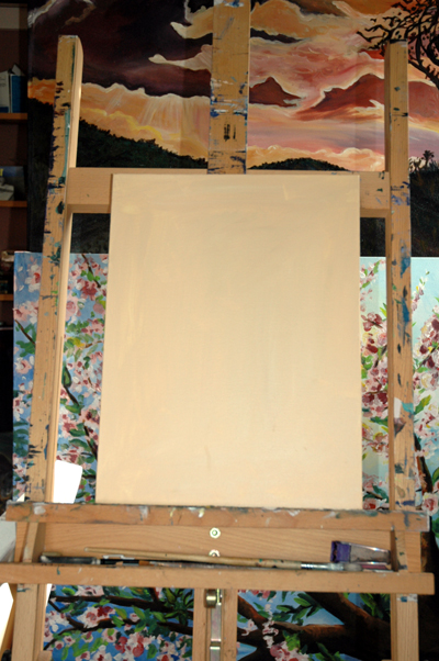
In the past, I have experimented with toning my canvas before painting, and with portraits especially, I have noticed that it can be helpful. I think I’m going to do that from now on, and I was thinking that if I could figure out a persons average skin tone and use that as my starting point, it’d help even more. Then I wouldn’t have to continually mix the same color.
I’m pretty good at color mixing, but even so, it’s can be really hard to get skin tones exactly right. People have all kinds of weird colors in their skin that you wouldn’t expect…lime green, neon blue, all shades of purple, yellow, cool gray, warm gray, you name it. If you take it just a little too far with one of these intense colors, you end up with mayhem: an otherwise beautiful woman with a bright orange blotch on her cheek, or an unsightly green moustache, or a sickly pallor to her skin. But if you get it just right, with that vivid color incorporated in a subtle way, you get magic. Like realism but just a little better.
I’ve been thinking that toning my canvas might allow me to incorporate such colors while still keeping them in check, as I’d have that nice even skin tone to compare other colors with as I paint.
So I’m painting my next portrait on a toned canvas:
People have expressed interest in seeing more photos of my studio, so I figured I would share this lovely view of the wall that holds my excellent shelves. They have been invaluable in helping me stay organized.
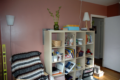
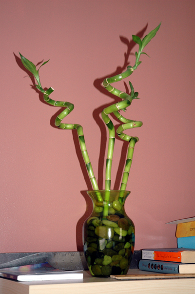
Notice also my lucky bamboo. It makes me happy daily. I am finding that simple little things like this incorporated in my studio make it a much nicer work environment.
