Here is Bright Woods, 3′ wide by 4′ tall–about 122 x 99 cm, for those who read in metric.
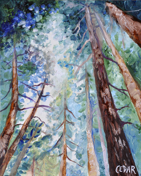
I determined the basic composition for this large-scale painting in an earlier small study (at the bottom of this post)–while the composition of the large painting is similar to that of the study, the colors ended up quite different. I chose to make the red of the tree trunks brighter and redder, the greens more saturated, the sky lighter, and the shadows darker. The result is more saturated color and higher contrast.
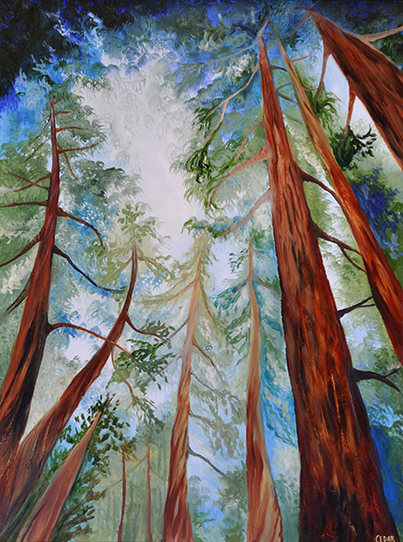
When painting the large one, I really focused on the fact that I wanted these woods to be “bright,” and to create a feeling of everything being sharp and clear, so when you “step into” this painting, so to speak, you can feel the bright sunlight all around you, warming your skin, you can smell the sharp earthy scents of the forest floor, and you get the feeling of clean air filling your lungs. The colors and movement are intended to highlight the life force of the trees as they reach, growing and twisting towards the sky.
Some of my favorite details in this painting are the few spots I intentionally added more clearly detailed foliage against a background of foliage that’s blurred by the atmosphere of the background:
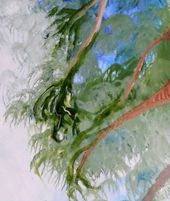
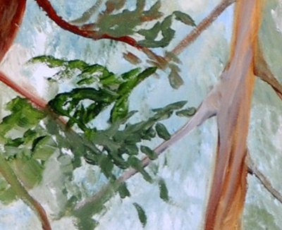
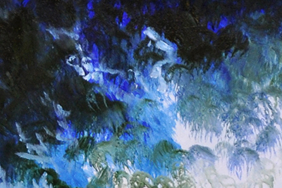
I also love the nuances in this gradation of color in the top left corner–from dark green-black to bright ultramarine blue to cerulean/cobalt teal, into gray-green and white.
Here is the small study I created first:
I’m finding that working out my design and thought process with a small study before doing a large piece gives me a lot of clarity about what I really want, allowing me to execute my intentions more quickly and effectively when I tackle the large-scale version.